When Comfort Becomes a Liability:
The Case for Bold Brand Evolution
For many heritage brands, visual consistency feels like loyalty, and for a while, it is. But markets shift, consumer expectations change, and what once read as brand stability can start to read as stagnation. When that gap opens up between what a brand is and how it looks, it's usually time to act. That's the position Peppermint Field was in when they came to Appart_, a branding agency in Bangkok working across identity, strategy, and product design. Not a broken brand. A brand that had outgrown its visual identity.
A Heritage Brand at a Crossroad
Peppermint Field sits within the Bertram Labs family, a Thai pharmaceutical group founded in 1958, in a category alongside names like Siang Pure. But where much of that category leads with medicinal utility, Peppermint Field has always occupied slightly different territory: lighter, more portable, more present in everyday life than in the medicine cabinet.
For Thai consumers, the inhaler is a familiar and personal product. It has been a cultural touchstone for decades, found in handbags, on desks, in the pockets of anyone who knows that particular rush of cool peppermint clarity. For foreign visitors, it tends to be a discovery; something distinctly local that doesn't feel like a souvenir. That crossover appeal is genuine brand equity, and it pointed clearly toward where the brand could go: a contemporary therapeutic lifestyle product with real international reach, built for an audience that's active, well-traveled, and design-conscious.
The brief wasn't to reinvent the brand. It was to build a visual identity that matched what the brand already was
The Process:
Reading Between the Briefs
We start where most branding projects start: questions, consumer data, competitive research. Anyone can run the process. What we think matters is what you're looking for inside it: going beyond direct competitors to study the wider emotional landscape, pressure-testing feelings and associations rather than just market gaps, and finding the edges of where a brand can go before recommending how far to move. That's where the more interesting decisions tend to live, and that's what we're trying to get to before a single visual is made.
Appart_ works across brand strategy, design, cultural research, and communication, and the team brings different cultural backgrounds into the room. When a brand needs to speak to Thai consumers while remaining legible to an international audience, that's not a problem you solve by checking two boxes. It requires holding both perspectives simultaneously, understanding how a visual choice reads locally while knowing how it lands elsewhere. That's less a methodology and more a way of working that shapes decisions that don't show up in any guidelines document.
The competitive research went beyond the inhaler category. Direct competitors tell you where the boundaries are; what's more useful is the brands sitting adjacent to those boundaries, compact lifestyle objects, travel wellness essentials, design-led everyday carry. Understanding how those brands position themselves, and how they execute visually, opens up a much wider sense of what's possible and where a brand like Peppermint Field could genuinely stand apart. Consumer personas followed the same logic: built around values and lifestyle rather than demographics, because attitude matters more than age bracket.
The answers we are looking for live in culture and context, not just in purchase data.

Building the Visual System
Building a visual system, not just a logo, is standard practice now. The more interesting question is what informs the decisions inside it. For Peppermint Field, it meant building something rooted enough to feel Thai and open enough to travel.
The Logotype
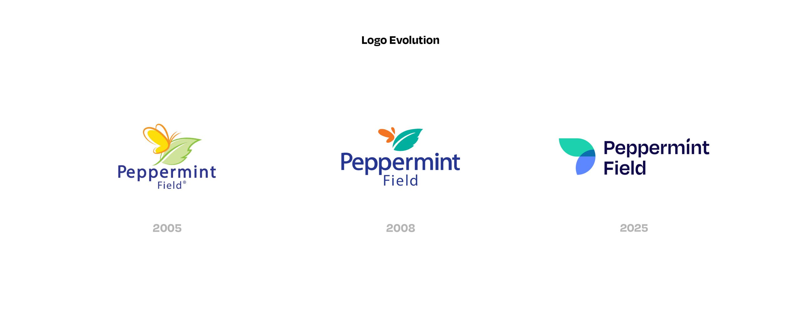
We started by deconstructing the existing mark rather than replacing it. The geometric and typographic elements already inside it became the foundation for the new identity, a cleaner, more confident version of what was already there. Its real function is structural: everything else in the system, the typography, the graphic elements, the patterns, traces back to the logic of the mark.
Typography
For a Thai brand operating globally, the type system needs to work in two scripts simultaneously and feel consistent across both. We worked to find an English and Thai pairing where the weight, detail, and character of each genuinely matched: not a translation, but two expressions of the same voice. The audience being targeted is chic and discerning, well-traveled, at home in international contexts; the typeface needed to carry that without spelling it out. It also needed to hold in motion, across video and digital content, where type does a lot of the heavy lifting.
Colour
The primary palette, deep blue and vibrant green, anchors the brand in freshness and energy. The more deliberate decision was what to do with the yellow and orange from the original identity. We kept them, reframed as accents within the cooler primary system. They add warmth and provide continuity for existing consumers without pulling the brand back toward where it was.
Iconography & Pattern Systems
From the geometry of the mark, we built out a family of graphic elements: icons, modular patterns, compositional motifs, that extend the identity across digital and offline contexts. Social content, campaign assets, outdoor, motion; the system holds across all of it. The goal is that the brand feels recognizable in any format, not just when the logo is present.

Packaging as Brand Expression
The first product to carry the new identity is a newly designed inhaler, compact, dual-chamber, matte black, with the refreshed logotype.The first product to carry the new identity is a newly designed inhaler, compact, dual-chamber, matte black, with the refreshed logotype. It's a considered object. It doesn't look like a pharmacy product, which is the point. The design is consistent with where the brand is going: something you'd keep on a desk or drop in a bag without thinking twice about it.

What This Project Illustrates
The Peppermint Field project is a useful example of how rebranding a heritage brand actually works. You're not starting from scratch, and you're not just refreshing surfaces. You're making a series of decisions, about where the brand sits, who it's for, what it communicates, and then building a visual system that makes all of that legible without over-explaining it.
Strategy shapes the creative work. The two aren't separate tracks that merge at the end; the thinking is present in every decision, from the logotype through to the packaging. When that's working, the output holds together in a way that's hard to pull apart, and that's what gives a rebrand longevity. McKinsey's latest State of Marketing research names branding as the number one priority for CMOs in 2026, identifying it as the foundation for resilience and long-term growth, particularly as markets become more uncertain and tools move faster.
Conclusion
Peppermint Field is a useful reference point for what a considered rebrand looks like in practice: not a reinvention, but a brand finally catching up to what it already was.
If your brand is at a similar point, get in touch. We work with brands across Bangkok, Hong Kong, and Singapore.

Frequently Asked Questions About Rebranding a Heritage Brand
How do you know when a heritage brand is ready for a rebrand?
Usually it’s a combination of things: competitive pressure, a shift in target audience, or international expansion plans. The clearest internal signal is when the brand’s visual identity can no longer carry its ambition is when what you look like no longer matches where you’re headed.
What does a branding agency actually deliver in a rebrand beyond a new logo?
A complete visual system: the refreshed mark, typography, colour, graphic language, and the asset architecture that governs how everything works together. The logo is one element of that, not the output.
How do you balance modernization with brand equity in a rebrand?
By treating what already exists as material to work with, not something to replace. In the Peppermint Field project, the existing logotype became the foundation for the new system. The result feels connected to the original without being nostalgic about it.
What is the difference between a visual identity and a visual system?
A visual identity is a set of elements: logo, colours, fonts. A visual system is the logic that governs how those elements interact and extend across every context the brand operates in. One is static, the other is built to be used.
How can Appart_ support our rebrand in Bangkok, Hong Kong, or Singapore?
At Appart_, we work across various services, from brand strategy, identity, packaging, and communication. As a branding agency in Bangkok with reach across Hong Kong and Singapore, we support brands across the region. Get in touch to talk through what you’re working on.